
Themes
A theme sets the colours, fonts, spacing and corner radius of bide's visual pages: the run viewer (bide view), the flow editor (bide edit) and, with the system's settings only, the approve page. The design, including what a theme can never change, is in Themes.
Status. The run viewer (bide view, and the diff and config pages it serves) draws from the checked themes: light, dark and high-contrast, plus a theme file of your own with -theme, and the flow editor (bide edit) takes the same two flags and draws the same way. The approve page uses the shipped themes inside its pinned bundle, chosen by the system's settings alone (below).
A theme is data: a JSON file of typed values, never CSS. It cannot add a selector, a property, a URL or a function, so it cannot hide, move or restyle a control. It also cannot change a word, an icon, a dash pattern or a border style: the meaning of each state (completed, waiting, halted, gated) is carried by those, and a theme only chooses the colours that go with them.
The file
{
  "bide_theme": 1,
  "name": "acme-night",
  "base": "dark",
  "surface": { "bg": "#0e1116", "surface": "#161b22", "accent": "#79b8ff" },
  "semantic": { "ok": { "fg": "#56d364", "bg": "#12261a" } },
  "radius": { "sm": 4, "md": 8, "lg": 12 }
}
base is one of the shipped themes (light, dark, high-contrast); every key you leave out is taken from it, and the checks run on the result. name is lower case letters, digits and hyphens (2 to 32 characters) and is not a shipped name. The file is at most 16 KiB. Keys are exact: an unknown key, a repeated key, or "BG" for "bg" is an error.
If you set surface.accent and not semantic.info.fg or surface.focus, those follow the accent (and info.bg follows accent_bg); if you set surface.surface and not canvas_bg or node_fill, those follow the surface. Set them yourself to keep them apart.
A colour is #rgb or #rrggbb and nothing else (no names, no rgb(), no var(), no alpha).
| Key | Holds |
|---|---|
surface.bg, surface, surface2 | the page, a card or input, a pill or code block |
surface.text, muted | body text, secondary text |
surface.border, border_strong | decorative borders, the edge of a control (it must reach 3:1) |
surface.accent, accent_bg, on_accent, focus | links and the primary button, its tint, text on the button, the focus ring |
surface.canvas_bg, node_fill | the flow graph's ground and the fill of a node with no state |
semantic.ok, info, warning, alert, gated, effect, idem | each { "fg", "bg" }: the colour of the state and its tint |
semantic.idle | { "fg" }: not reached, unknown, an edge not taken |
semantic.on | { "fg" }: a glyph drawn on a solid state colour |
syntax.key, str, num, bool, null, punct | JSON highlighting |
shadow | none, soft, strong |
scrim | the darkness behind a dialog, 0.40 to 0.80 |
font_ui | system-sans, system-serif, humanist, rounded |
font_mono | system-mono, code |
type_scale | a multiplier, 0.90 to 1.25 |
density | compact, normal, roomy |
radius | { "sm", "md", "lg" }, whole pixels 0 to 16, sm <= md <= lg |
Fonts are a fixed list: a theme cannot name a family, load a web font, or pick a face that renders 0 and O alike on a page that shows digests and ids.
The checks
bide theme check theme.json parses a file, resolves it against its base, and prints each failed measure with its value and threshold. It exits 0 when the theme passes, 1 when it is refused or cannot be read, and 2 for a usage error. -v prints every measure.
| Check | What | Threshold |
|---|---|---|
| C1 | Text contrast (WCAG 2.x ratio): text and muted on every ground and tint, each state colour on the grounds and its tint, glyph on state colour, accent, syntax colours | 4.5:1 |
| C2 | Non-text contrast: focus ring and control edge on the page, a panel, a nested panel and the graph canvas (the focus ring also on a node's fill and the selected item's tint), idle | 3:1 |
| C3 | The status colours ok, warning, alert, info are distinct (CIEDE2000) | at least 20 |
| C4 | gated, effect, idem and idle are distinct from every other state colour | at least 10 |
| C6 | C3 again after simulating protanopia, deuteranopia and tritanopia | at least 8; a warning for your theme, an error for a shipped one |
| C8 | alert is warm (hue 340 to 100 degrees) and ok is not; alert is nearer red (hue 30) than warning is; ok, warning and alert have chroma of at least 20 | as stated |
Ranges and enums (C7) are checked while the file is read. A theme that fails any check but C6 is refused. Every key and value in an error is quoted, so a file cannot print a terminal escape.
Using a theme
bide view -theme theme.json ...andbide edit -theme theme.json ...add the theme to the pages' list, after the shipped ones. A file that is not a valid theme (a parse error, an unknown or repeated key, an out-of-range value) or that fails a contrast, distinctness or polarity check (C1 to C4, C8) is refused before anything is served, with each failure on stderr and exit status 1. The colour-blindness check (C6) only warns: the warning is printed and the theme is served.-theme-default namestarts the pages inlight,dark,high-contrastor your theme, instead of following the system's light or dark setting. A reader who has switched themes keeps their own choice, which the browser remembers.- The sun button in the viewer's header (and the editor's Theme button), or
tin the viewer, steps through the list, names the theme it shows and announces the change to a screen reader.
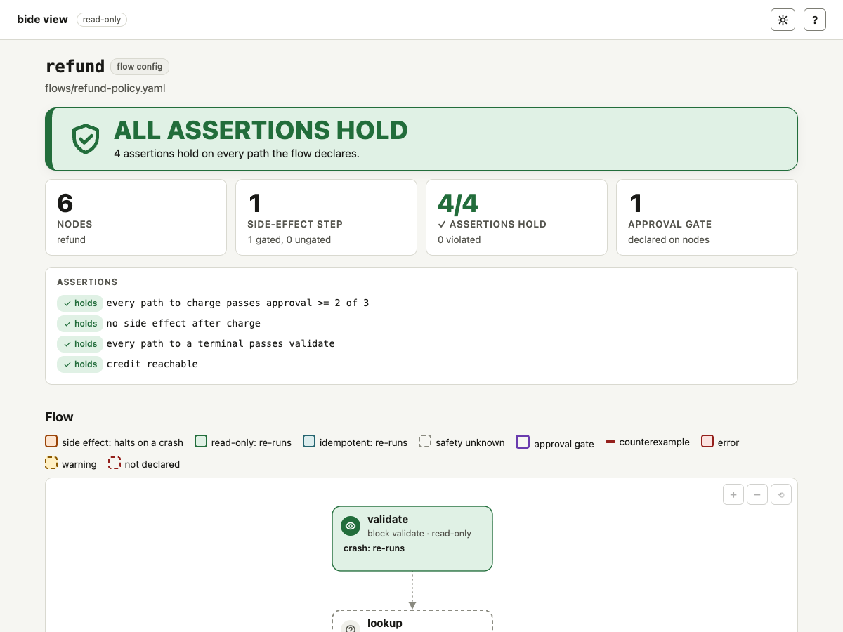
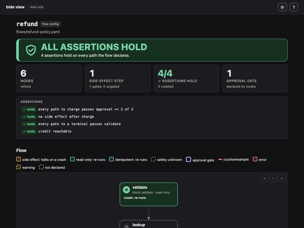
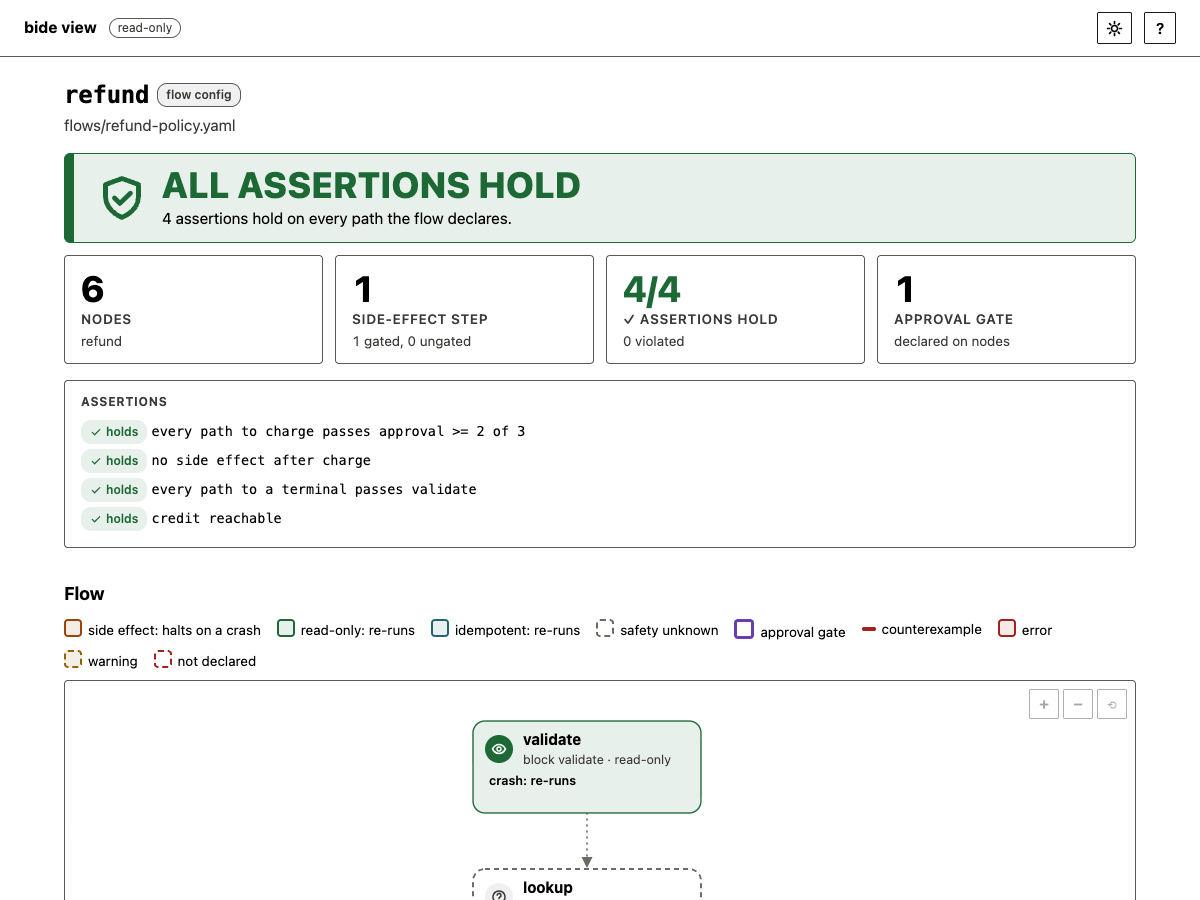
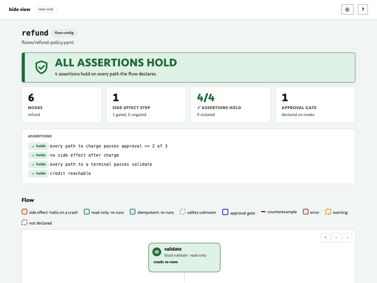
The same page, a flow config's risk map from bide view -config, in each shipped theme and in a custom one (the theme file is assets/demo/browser-shots/acme-teal.json: a light base with a grey-green ground, a teal accent, its own focus colour, a humanist font, small corners and roomy spacing; bide theme check accepts it):
Embedding in a Go program
A program that serves the viewer's pages or the editor itself chooses their themes in Go. The github.com/bide-ai/bide/theme package (0.x, no third-party dependency) reads and checks a theme exactly as bide theme check does; the handlers take the checked values:
th, report, err := theme.Load("acme.json") // or theme.Parse(data); err is a *theme.CheckError on a failed check
if err != nil {
	log.Fatal(err)
}
for _, m := range report.Failures(theme.Warning) {
	log.Print(m) // the colour-blindness warning
}
h := planview.Handler("orders.json", data, reg,
	planview.WithThemes(th),
	planview.WithDefaultTheme("acme-night"))
planview.Handler and planview.DiffHandler take the options after their arguments; flowedit.New takes the same three, flowedit.WithThemes, WithDefaultTheme and WithThemeLock.
WithThemes(themes...)adds themes to the shippedlight,darkandhigh-contrast.WithDefaultTheme(name)is the theme a reader starts in, as-theme-defaultis.WithThemeLock(name)makes one theme the only one: no switch in the header, no remembered choice, and the system's light or dark no longer picks the start. It is for a host whose pages must look like its own product.
A host passes only what Parse or Load returned. It cannot pass CSS or a selector, there is no way to build a *theme.Theme from fields, and the stylesheet is generated from the checked values alone, so a host cannot skip the checks C1 to C8 or draw the pages in a way the checks have not measured. The same holds for a lock: a reader whose system asks for more contrast gets high-contrast, and a reader whose system forces colours gets the system's colours, over a default and over a lock (a test in Chrome holds both).
A theme that is nil, did not come from Parse or Load, or has the name of another theme (a shipped one included), a default or a lock that names no theme, and a default that differs from a lock are mistakes of the host program: planview.Handler and planview.DiffHandler panic when they are built, as http.ServeMux.Handle does on a bad pattern, and flowedit.New returns an error.
Contrast and forced colours
- More contrast. A reader whose system asks for more contrast (
prefers-contrast: more) gets thehigh-contrasttheme: black text on white, borders and strokes at 4.5:1 or more, text at 7:1. It wins over the dark system setting and over a-theme-default, and a reader who has chosen a theme in the page keeps their choice. - Forced colours. When the system forces colours (Windows contrast themes,
forced-colors: active), the system's colours win over every theme, a default and a reader's choice, and a theme file cannot change that. Every state then draws in one colour, so the graph tells the run states by the shape of the node's box: a thin solid box is done, dashes attempted, dash-dot waiting, a heavy solid box halted, dots not reached. The glyph and the words in each node stay. The theme button then says that the system's colours are in force, and the focus ring is the system's Highlight colour. Which pairs the system's palette makes readable is the system's choice (a Windows contrast theme sets them); bide maps its roles to the system colours and does not check the palette. - Controls. The edge of every input, select and button is the
border_strongcolour, which must reach 3:1 against the surface under it in every theme. Decorative borders (cards, tables) use the quieterborder.
The approve page
The approve page takes no theme file and no flag. Its bundle (index.html, page.js, app.css, pinned by the signed approve-page.SHA256SUMS) carries the shipped themes: light and dark by your system's colour scheme, high-contrast when it asks for more contrast, the system's colours under forced colours. Nothing a script, a URL, config.json or the host supplies can choose or change the look, which is what keeps it inside the pin: what an approver sees depends on the pinned bytes and their own system settings. A deployment that wants other colours forks the bundle and pins its own hash. See the approve page's design.
What a theme can never change is in the design note: no selector, no property, no word, icon or shape.